Logo
The identity system of SKOOP Media consists of an icon and the wordmark. This is the primary logo and identifies SKOOP Media as a whole. The icon is the S of SKOOP and stands for boldness and ambition.
When visualizing both labels, the icon and the name of the label (Prime and Family) are used as a wordmark.
The brand name
In written text, the brand name SKOOP Media should always involve SKOOP written in capitals, to create a mild stand-out effect. This is also the case when identifying the labels in written form: SKOOP Prime and SKOOP Family. Third parties should be asked and encouraged to do the same.
Palette
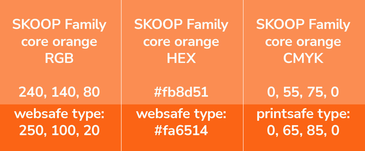
SKOOP Media is bold and diverse, which inspired the two main hues in our core palette. The SKOOP Media corporate palette consists of two colours SKOOP Media (a deeper shade of) blue and (mild) orange:
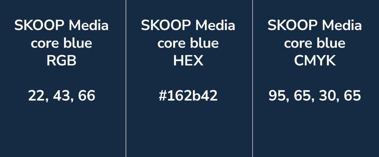
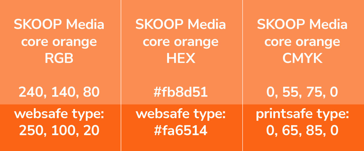
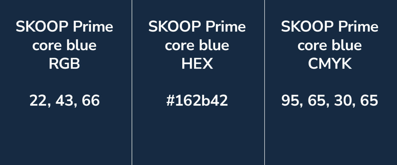
The Prime label consists of SKOOP Media blue and the Family label of SKOOP Media orange:
The primary colour logo should be used on a white background for maximum impact and clarity:
In cases where the primary colour logo is not visible or is not appropriate, the following versions are available for use:
The logos for print and screen use can be downloaded here.
Primary Font
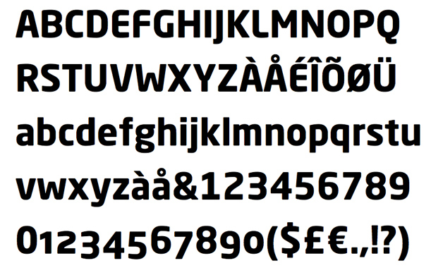
The primary font Neo Sans is a legible font without being neutral, nuanced without being fussy, and expressive without being distracting. It is a rounded, square sans letterform. This font has been used for creating the wordmark and is used for titles, headers, presentations and lead-ins (introduction/summaries).
Secondary Font
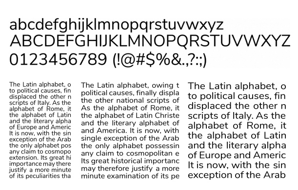
The secondary font Nunito Sans is a well balanced sans serif typeface, a regular non-rounded terminal version and optimized for great readability in longer texts. It includes a complete set of glyphs and weights and creates a balanced contrast when paired with the Neo Sans. The secondary font is used for long lengths of body text and quotes.
Web-safe font
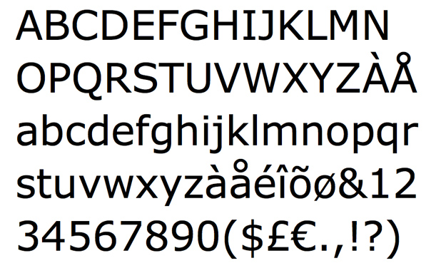
When there is no embedding possible, the font Verdana is used. Verdana is popular both online and off. While it resembles Arial and Helvetica, it has a simple structure that makes the letters large and clear.