The SKOOP Media logo uses two colours: SKOOP Media blue and orange. The Prime label consists of SKOOP Media blue and the Family label of SKOOP Media orange. Primarily the logo should be used on a white background for maximum impact and clarity:


In cases where the primary colour logo is not visible or is not appropriate, the following versions are available for use:


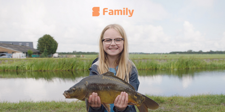
Logo use on Photos
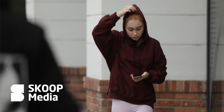
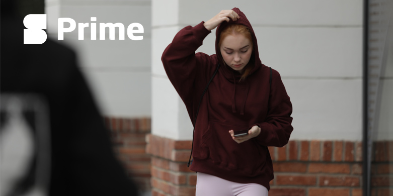
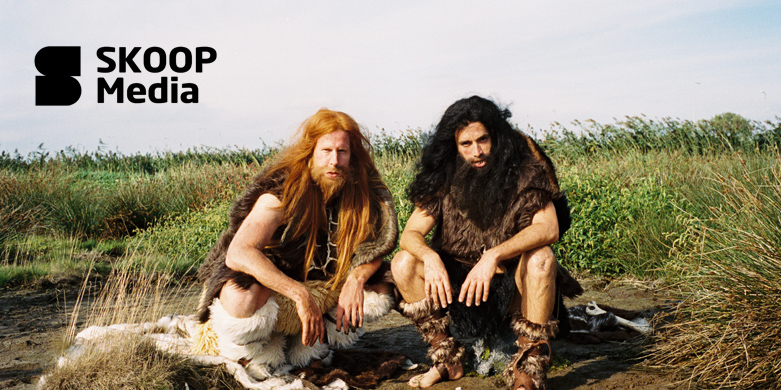
- Use the SKOOP Media and label secondary logo white on dark backgrounds or dark part of photos that provide sufficient contrast for all logo components.
- Use the SKOOP Media and label secondary logo black on light backgrounds or light part of photos that provide sufficient contrast for all logo components.




Clear Space & Sizing
The minimum clear space is defined as x. For the SKOOP Media logo measured by the width of the vertical stroke of the letter ‘M’. For the SKOOP Prime logo measured by the width of the vertical stroke of the letter ‘P’. For the SKOOP Family logo measured by the width of the vertical stroke of the letter ‘y’. The minimum clear space of x should always be applied. Try to maximize clear space whenever possible.
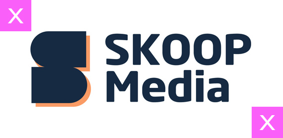


Minimum size
The minimum size of our SKOOP Media logo is 45px on screen, or 9 mm in print, measured by the height of the logo. In exceptional circumstances, smaller sizes for print may be necessary (e.g. on event merchandise). In such cases, legibility should always be your top priority.

The minimum size of our SKOOP Prime and Family logo is 30px on screen, or 6 mm in print, measured by the height of the logo. In exceptional circumstances, smaller sizes for print may be necessary (e.g. on event merchandise). In such cases, legibility should always be your top priority.

